Maemo.org logo contest submissions: Difference between revisions
imported>rsuplido |
imported>rsuplido |
||
| Line 141: | Line 141: | ||
=== rsuplido === | === rsuplido === | ||
[http://en.wikipedia.org/wiki/Helvetica Helvetica] is used on all logos, my favorite font. I hope you enjoy them. --[[User:rsuplido|Reggie]] 13:45, 21 June 2008 (UTC) | [http://en.wikipedia.org/wiki/Helvetica Helvetica] is used on all logos, my favorite font. All logos use tangerine as the background but can be anything. I hope you enjoy them. --[[User:rsuplido|Reggie]] 13:45, 21 June 2008 (UTC) | ||
<gallery widths="300px" perrow="2"> | <gallery widths="300px" perrow="2"> | ||
Image:Maemo.org_logo_contest_rsuplido_1.png|Morse Code: Simple and sharp. I added the [http://en.wikipedia.org/wiki/Morse_code morse code] version of 'maemo' at the bottom to signify a classic sense of 'communication.' Click image for a sharper version of the logo. | Image:Maemo.org_logo_contest_rsuplido_1.png|Morse Code: Simple and sharp. I added the [http://en.wikipedia.org/wiki/Morse_code morse code] version of 'maemo' at the bottom to signify a classic sense of 'communication.' Click image for a sharper version of the logo. | ||
Revision as of 14:25, 21 June 2008
This page contains submissions for the maemo.org logo contest. The contest is now open! The closing date for entries is the 27th of July, 2008. For rules and submission guidelines, please see the contest page.
Entries for maemo.org logo contest
attila
-
 Maemo Butterfly (shadows)
 -
 Maemo Butterfly (no shadows)
 -
 Maemo Butterfly Inverse (shadows)
 -
 Maemo Butterfly Inverse (no shadows)
deadknight88
crawfordm
-
 Signifying community and wireless technology.
thiercito
jobelium
I did that with free font and a lot of fun ! :p
J'ai fait cela avec des fonts gratuit et beacoup de plaisir ! ;)
rsperberg
-
 Re-using Karoliina's original color scheme
 -
 More logo-like
 -
 Maemo.org isn't a company but a group of people who all contribute toward the same goal. So you don't get "machined" results. But a lot of the vibrancy comes from the non-automaton approach that is the essence of Linux and the FOSS movement.
 -
 Version with splashier colors (but any could be used). The handlettering is available as a font so that it can be used for tabs, titles and such in the wiki redesign.
 -
 When a horizontal layout is inappropriate, a square form can be used instead.
 -
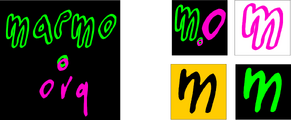 The square form with splashier colors. Favicon could use "m.o" or just "m" to remain readable, in the color scheme chosen, of course.
GarethLWalt
-
 Alternative to image #2. I've added the .ORG and avoided the common orange as an example.
baksiidaa
-
 I like having the ".org" as a superscript—that way it's a non-integral part of the logo that could be replaced to create a logo for something besides the website.
 -

-

joeaguy
-
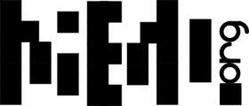
 Bitmap with negative space, wide. Big, bold, technical, with a soft edge.
 -
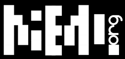
 Bitmap with negative space, narrow. Minimalist pixel theater.
 -
 Bitmap with negative space, narrow and inverse. Now is the time on Sprockets when we dance.
Narbat
Variations on a theme, using different fonts. The "ae" in "maemo" seems to stand out, so I wanted to incorporate that into the design. I also wanted to incorporate something about what the platform is, hence the globe and wifi signal bars. These logos can be used with the full "maemo.org" spelled out, or just the globe and "ae" portion for when something narrower is needed. In the variations you can see what the logo looks like in monochrome, and how it looks as a 16x16 favicon. This logo uses only four colors (blue, green, orange, and black) with no gradients or dithering, which makes it easy to silk-screen onto a t-shirt.
-
 Font A
 -
 Font A Variations
 -
 Font B
 -
 Font B Variations
 -
 Font C
 -
 Font C Variations
 -
 Font D
 -
 Font D Variations
 -
 Font E
 -
 Font E Variations
jussi
-
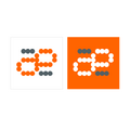
 The idea: The a and e ligature formed of dots signifies that the maemo is built on the collaborate effort of the community, and the mœbius loop / strip embedded in the ligature shows that there are infinite possibilities when you work together.
 -
 Symbol only, to use for instance as favicon or on t-shirt print.
 -
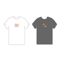 T-shirt examples
calderov
-
 I hope you like this ^^.
chrismtn
-
 Have fun!.
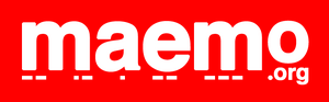
rsuplido
Helvetica is used on all logos, my favorite font. All logos use tangerine as the background but can be anything. I hope you enjoy them. --Reggie 13:45, 21 June 2008 (UTC)
-
 Morse Code: Simple and sharp. I added the morse code version of 'maemo' at the bottom to signify a classic sense of 'communication.' Click image for a sharper version of the logo.
 -
 Zen: maemo is syllabicated and placed inside a Zen Enso symbol. Parts of 'maemo' and '.org' touch the circle. Circle is intentionally broken since "imperfection is an essential and inherent aspect of existence." Click image for a sharper version of the logo.
 -
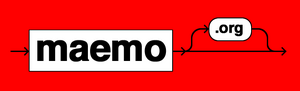 Syntax 1: maemo.org is represented in a Syntax diagram. It somehow shows that maemo can be open source via the '.org' or can be bypassed, maybe to signify commercial apps. Click image for a sharper version of the logo.
 -
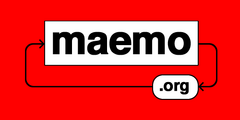 Syntax 2: maemo.org is represented in a Syntax diagram. A playful version to represent an infinite loop -- a never-ending maemo community discussion. Click image for a sharper version of the logo.
