Talk:Maemo.org logo contest submissions: Difference between revisions
imported>sohle No edit summary |
imported>sohle m →sohle |
||
| Line 86: | Line 86: | ||
<gallery widths="300px" perrow="3"> | <gallery widths="300px" perrow="3"> | ||
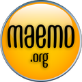
Image:Maemo.org_logo_contest_sohle_1.png|1: Easy to read font, only | Image:Maemo.org_logo_contest_sohle_1.png|1: Easy to read font, only two different colors, abstract people building the logo from the left and right side (symbolizes the community) | ||
Image:Maemo.org_logo_contest_sohle_2.png|2: Same theme, different font | Image:Maemo.org_logo_contest_sohle_2.png|2: Same theme, different font | ||
Image:Maemo.org_logo_contest_sohle_3.png|3: Same theme as submission 2 but with bold "ae" | Image:Maemo.org_logo_contest_sohle_3.png|3: Same theme as submission 2 but with bold "ae" | ||
Revision as of 13:44, 26 June 2008
Proposals with "Maemo"
Even if it's clear in the instructions that the logo needs to have the text "maemo.org" and only that, there are many proposals on "Maemo". What should we do with them? Take them out of the submissions page? It would be counterproductive that other designers see the proposals and think that despite the rule it is ok to send more "Maemo" proposals.--qgil 20:30, 19 June 2008 (UTC)
- X-Fade and I were discussing this on #maemo earlier. We could:
- Drop the non-compliant submissions onto a separate page.
- Mark them as non-compliant with a template with lots of red borders and text.
- Remove them outright and notify the submitter that the submission is non-compliant.
- Not sure what the best solution is, but we do need to do something about it soon. —GeneralAntilles 20:42, 19 June 2008 (UTC)
- What about putting a disclaimer on the top i.e. Submissions not following the contest rules will be removed from this page and removing them? The logos themselves are still uploaded and etc, so no big harm. A "Maemo" logo will not win the contest in any way, so it's not like the author is losing something in practical terms. They better know asap that their entry hasn't been accepted.--qgil 03:09, 20 June 2008 (UTC)
Proposals with Tux penguin
Even if the Tux penguin is an image with a permissive license, I think we should discard those entries using it. The license still claims some kind of (very licit!) aknowledgement to the creator. The meaning is centered in the Linux Kernel. Right, Maemo uses this kernel and the maemo.org community has some kernel hackers. But that's it, a selected logo with Tux inside would be totally misleading. --qgil 19:34, 22 June 2008 (UTC)
Submissions discarded
Because of having "Maemo" instead of "maemo.org", having potential trademark issues or using existing logos (i.e. Tux penguin).
dzahariev
-
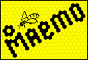 The main idea is that Open Source software is like honey and all other products that are produced inside bee hive from the united efforts of the bees. So the bees are developers and the Maemo is a result of their work. I am not so good in design, but I think that the idea have a potential.
 -
 This is an idea for the icon.
fredyrivera
-
 Maemo People Ico
 -
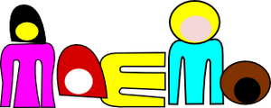 Maemo People
jobelium
-
-

-
-
-
-

-
-
-
-
-
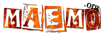
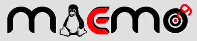
 college style with Tux !
 -
Tux with alternate font (i like the .org)
-
the same with alternate color
-
 the big colorfull Tux logo
 -
 the small Tux logo
 -
 an alternate version of the small logo
asgari
GarethLWalt
-
 Modern branding. This logo is easily readable at the size of a quarter. However, this pure vector logo is easily scaled to an unlimited size.
 -
 Custom typography. The lettering on this logo was created carefully on a grid. The color and outline are examples.
 -
 Alternative to image #1. Added .ORG and another color change. (Pretty self explanatory.)
- Discounted #1b as it's too similar to Palm, Inc's logo IMHO --Jaffa 00:08, 21 June 2008 (UTC)
- I would suggest a review of this image as well - if my logo was too similar to the old Palm logo --garethlwalt 14:47, 25 June 2008 (UTC)
- You know what? You're right... Didn't even think about it. I'll move it to below. --timsamoff 12:11, 26 June 2008 (UTC)
jussi
-
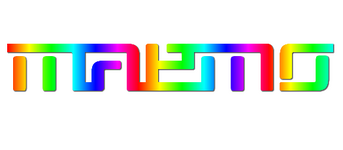
 I know this is a little above and beyond. I got a little carried away. These are ideas for implementation on the core maemo brand level, where colour can be used to signify the difference between the maemo os (green) and the maemo community (orange red). I suppose this is more up to Nokia. ;)
thiercito
timsamoff
-
 Submission #5 (main)
 -
 Submission #5 (favicon)
- Discarded -- as discussed above. --timsamoff 12:18, 26 June 2008 (UTC)
New Submissions
sohle
-
 1: Easy to read font, only two different colors, abstract people building the logo from the left and right side (symbolizes the community)
 -
 2: Same theme, different font
 -
 3: Same theme as submission 2 but with bold "ae"
 -
 4: Same theme as 1 but green
 -
 5: Same theme as 2 but green
 -
 6: Same theme as 5 but with bold "ae"
 -
 7: Small versions of 1, 2, 3 (for stickers, pins, etc.)
 -
 8: Small versions of 4, 5, 6
 -
 9: Alternative small versions
