Maemo.org logo contest submissions
From Maemo Wiki
This page contains submissions for the maemo.org logo contest. The contest is now open! The closing date for entries is the 27th of July, 2008. For rules and submission guidelines, please see the contest page.
Entries for maemo.org logo contest
attila
-
 Maemo Butterfly (shadows)
 -
 Maemo Butterfly (no shadows)
 -
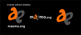
 Maemo Butterfly Inverse (shadows)
 -
 Maemo Butterfly Inverse (no shadows)
deadknight88
dzahariev
-
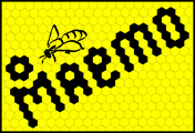 The main idea is that Open Source software is like honey and all other products that are produced inside bee hive from the united efforts of the bees. So the bees are developers and the Maemo is a result of their work. I am not so good in design, but I think that the idea have a potential.
 -
 This is an idea for the icon.
crawfordm
-
 Signifying community and wireless technology.
fredyrivera
-
 Maemo People Ico
 -
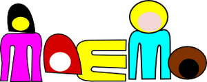 Maemo People
jobelium
asgari
rsperberg
-
 Re-using Karoliina's original color scheme
 -
 More logo-like
 -
 Maemo.org isn't a company but a group of people who all contribute toward the same goal. So you don't get "machined" results. But a lot of the vibrancy comes from the non-automaton approach that is the essence of Linux and the FOSS movement.
 -
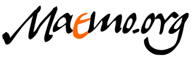
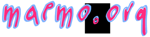
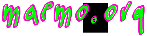 Version with splashier colors (but any could be used). The handlettering is available as a font so that it can be used for tabs, titles and such in the wiki redesign.
 -
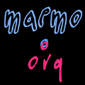 When a horizontal layout is inappropriate, a square form can be used instead.
 -
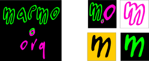 The square form with splashier colors. Favicon could use "m.o" or just "m" to remain readable, in the color scheme chosen, of course.
GarethLWalt
-
 Modern branding. This logo is easily readable at the size of a quarter. However, this pure vector logo is easily scaled to an unlimited size.
 -
 Custom typography. The lettering on this logo was created carefully on a grid. The color and outline are examples.
baksiidaa
-
 I like having the ".org" as a superscript—that way it's a non-integral part of the logo that could be replaced to create a logo for something besides the website.
 -

-
 Same as 2, but rotated
joeaguy
-
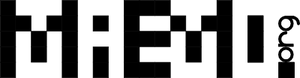 Bitmap with negative space, wide. Big, bold, technical, with a soft edge.
 -
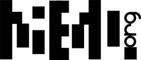 Bitmap with negative space, narrow. Minimalist pixel theater.
 -
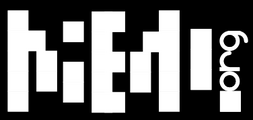 Bitmap with negative space, narrow and inverse. Now is the time on Sprockets when we dance.
